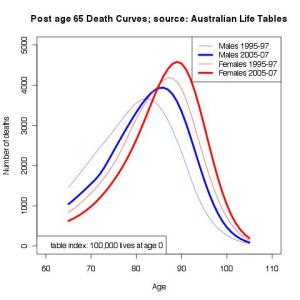
According to the old joke, while actuaries are able to tell you the number of people expected to die each year, Sicilian actuaries can tell you not only the number of people, but also their names and addresses. Last week I put up the shape of death curves in the ages after 65, according to Australian population studies. At roughly the same time, Mercer released a report indicating that it was the white collar workers who tended to live the longest. Continue reading
Month: August 2014
The shape of death, retirement incomes policy and property rights
The shape of death matters to policy makers, not so much to the individual. This image shows the number of expected deaths from age 65, based on a normalised starting group of 100,000 lives at birth. The underlying data has been extracted from the Australian Life Tables, published by the Government Actuary. Two tables are plotted here, based on studies in 1995-97 and 2005-07. Continue reading
