The Australian Government Actuary has released updated life tables of the Australian population based on the 2011 census. The media release is available at http://www.aga.gov.au/publications/life_table_2010-12/media_release.asp
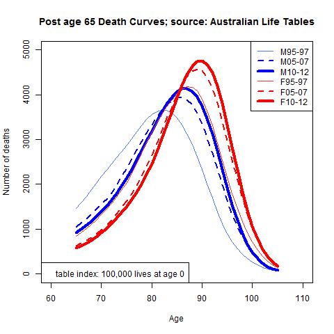
Continuing on a theme, I have updated my chart that shows the shape of mortality at older ages. The chart now shows the number of deaths at each age from 65, based on a standardized starting population of 100,000 at birth, over a 20 year period. The data is split for males and females.
There are some interesting conclusions to draw. Firstly, life expectancy continues to increase for both males and females but the improvements between 1995 and 2010 were more significant at older ages, ie from mid 80s and above. This is suggesting an increasing skew in the curve, with more people living to higher ages but then dying in greater numbers at those advanced ages. Secondly, the curve for men in 2010 now approximately matches the curve for women that existed based on 1995 data.
As always, while this has implications for retirement income planning at the policy level, it has less direct applicability at the individual level. Yes, it is true that life spans, on average, are increasing. But people don’t live according to averages.
